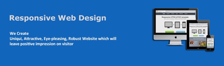
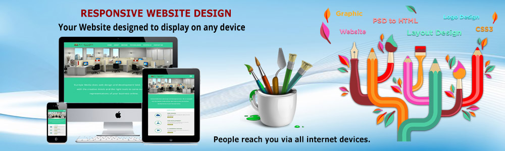
Responsive web design (RWD) is a web design approach aimed at crafting sites to present an optimal viewing experience, easy reading and navigation with a minimum of resizing, panning, and scrolling across a wide range of devices ranging from mobile phones, tablets to desktop computer monitors.
A site designed with responsive website design adapts the layout to the viewing environment by using fluid, proportion-based grids, flexible images and CSS3 media queries, an extension of the media rule.
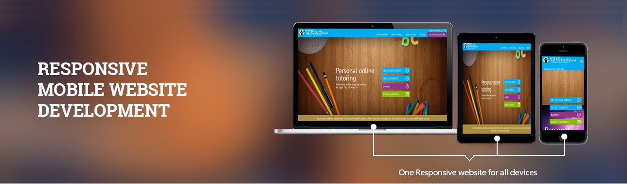
When a website is responsive it means mobile friendly, it will automatically adjust to the screen size of any device, say a mobile phone. It will consume the loading time and improve the performance of the website. All Internet users do not access the Internet only through their desktop or laptop computers with a normal resolution. Time has changed and it is time for us to change according to the time.
Responsive Web design is the approach that suggests that design and development should respond to the user's behavior and environment based on screen size, platform and orientation. The practice consists of a mix of flexible grids and layouts, images and an intelligent use of CSS media queries. As the user switches from their laptop to iPad/iPhone,the website should automatically switch to accommodate for resolution, image size and scripting expertise. In other words, the website should have the technology to routinely respond to the Internet user's preferences. This would eliminate the need for a different design and development phase for each new gadget on the market.
ENut technologies are the state-of-the-art Web developing company in the field of responsive web designing. We know the in and out of the web designing and how to design responsive websites in an enchanting way. You are the perfect place to build your website in the way you expected it to be.